Luca Leone
Milano, Italy
Milano, Italy
Mediadata
2013 - 2015
user interface and product designer
Mediadata is the company behind Mediaddress, the largest italian on-line platform for media relations developing.
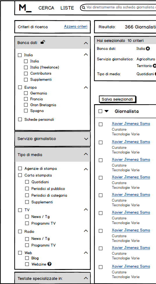
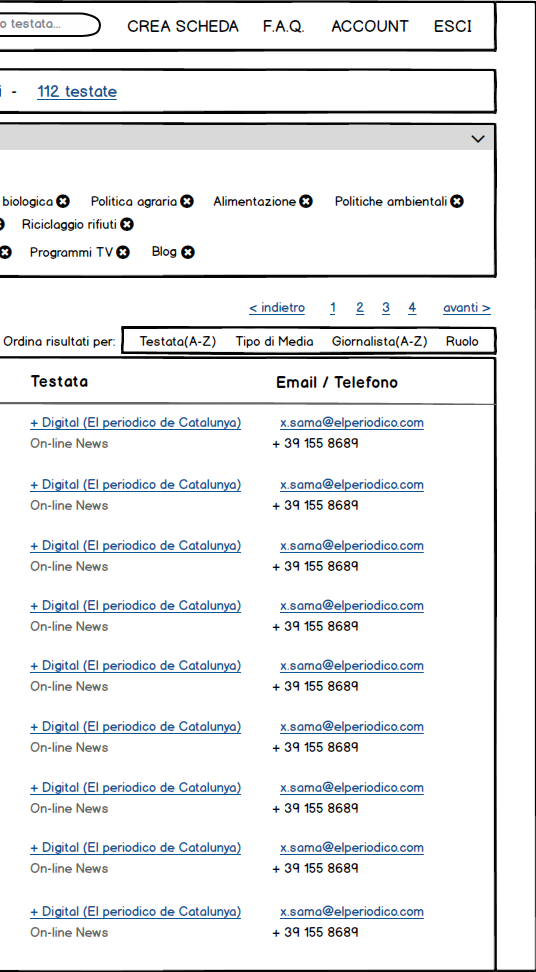

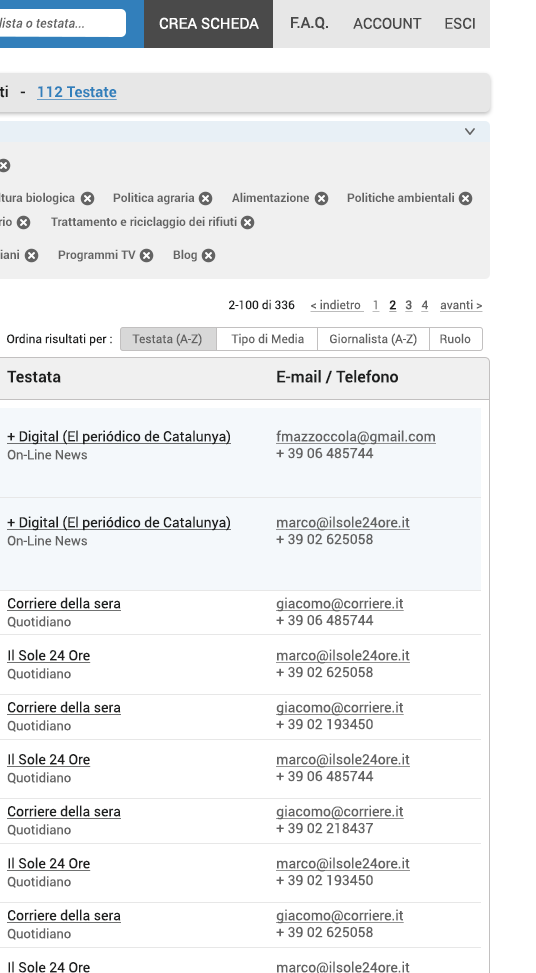
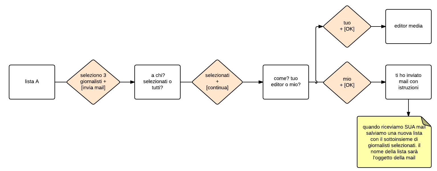
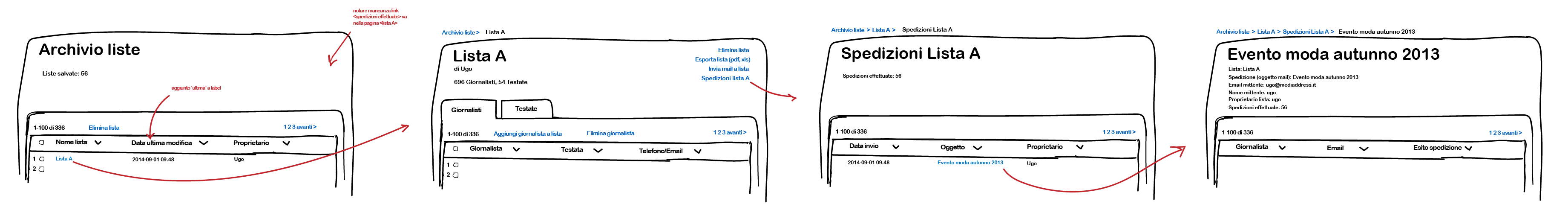
The main part of the Mediaddress web app is the advanced search. The other important part is the procedure to send a mail to a list of journalists.

Once the user gets the list of journalists, the task is to send them an email. Getting the flow right is a matter thinking and creating the best hypothesis to prototype.

Group A (new design)
Group B (old design)
How to do I know the new design is better than the old one? Randomized controlled trials: a great and objective way to understand if I did good. I took 2 randomly choosen groups of 3 people that had never seen the app. I asked them to complete 3 foundamental tasks. I measured the time to completion and compared the 2 group average time. 3 people per group is a small number, and it's not statistically significant, but the average different is huge.
| Paola | Eleonor | Annalisa | Average |
|---|---|---|---|
| 50" | 13" | 20" | 27'6" |
| 4'6" | 1'40" | 3'10" | 2'58" |
| 33" | 40" | 6'10" | 2'34" |
| Daniela | Isabella | Elisabetta | Average |
| 1'41" | surrendered | 2'45" | // |
| surrendered | surrendered | 4' | // |
| 8'10" | surrendered | surrendered | // |
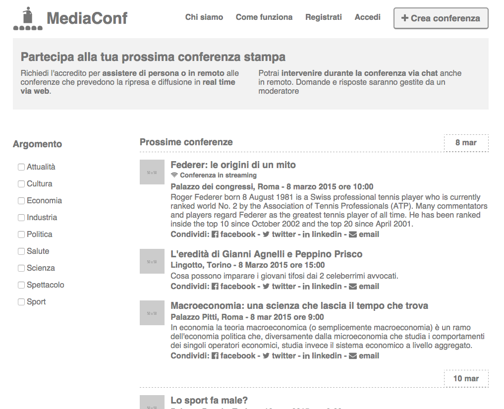
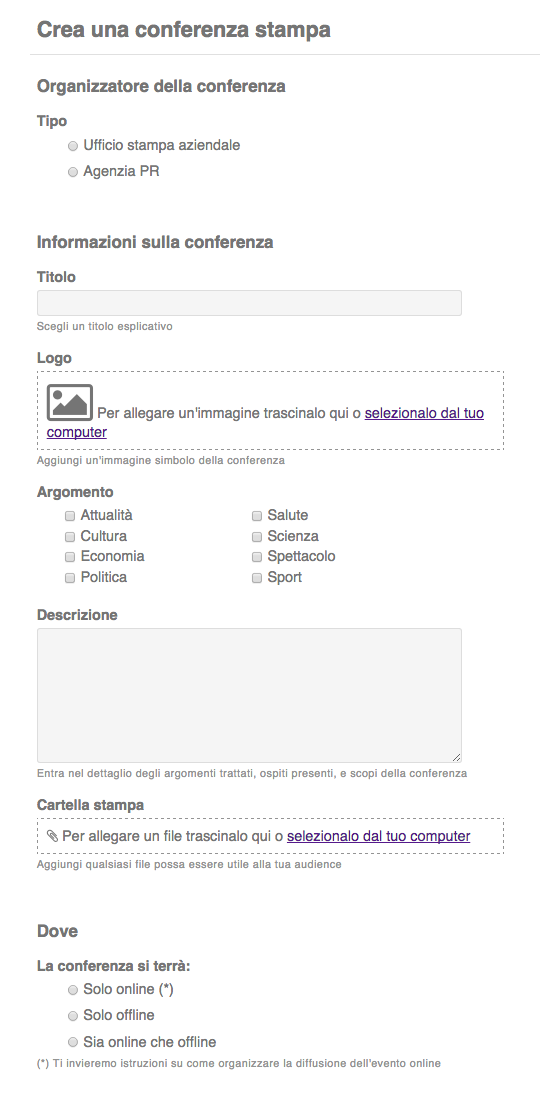
We are developing a new product, MediaConf. Press conferences delivered online.
check some design in the browser
Gallia Hotel
2015
experience and interface designer
"The glittering night" is a social event in Milan. 1500 people are invited to The Excelsior Gallia Hotel for a gala night. When they hired me, they had already sketched a mockup of the app. I didn't change much the concept, I just simplified the navigation. No tabs, no drawer. Just tags. People would use the app for a few hours, they need to figure it out in seconds, during a party. I wanted no barrier between them and the content.

check the HTML prototype → links in red
Ciao Gusto
2014
product & user interface designer
"Italia del Gusto" is a consortium comprising of important Italian firms with high quality products in the food sector. The goal for this project has been to design a content website, Ciao Gusto for the UK market to generate brand awareness.

This project gave me the opportunity to go deeper into the differences between the navigation by categories and the navigation by tags. Everything on the website is connected to the recipe, the main content.

Recipe page studies. The recipe is the epicenter of the webste. The recipes "are told" by the "italian food families", this should make this website different from other recipe websites.

Poinx
2014
product & user interface designer
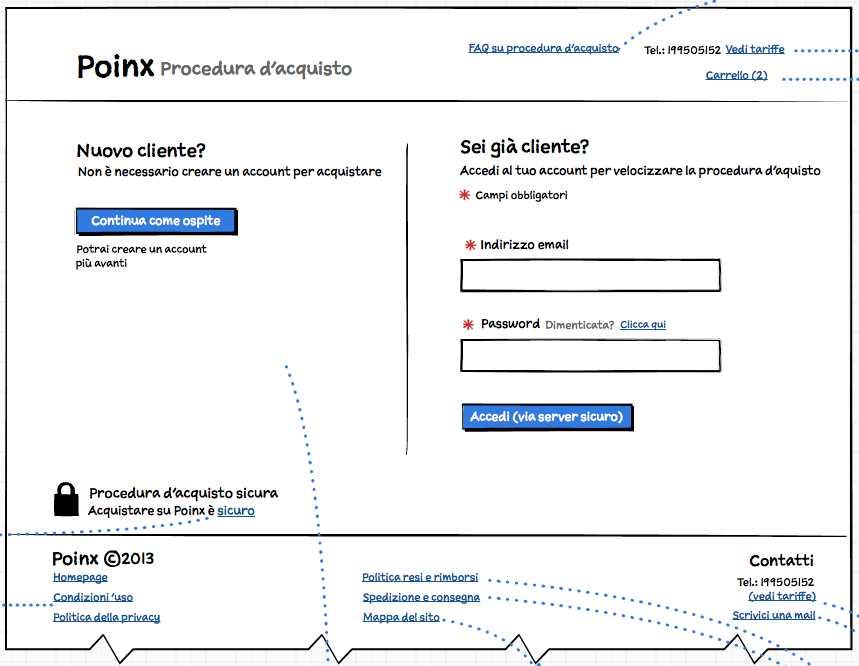
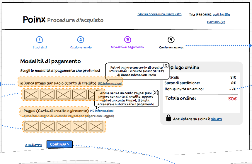
Poinx is a couponing ecommerce business. They hired me to increase sales. The new design should help to increase conversion rates of people navigating the site into buyers and newsletter subscribers.


The previous website didn’t have a cart. People couldn’t buy two coupons at a time.
- Coupons are virtual goods and physical products (that require the user to fill a form to get the address);
- People can have a bonus or a gift card;
- They can make a gift to a friend, which implies a different email to the receiver with no price indication;
- There are different payment options.
To optimize for checkout usability I applied the guidelines contained in the Baymard Institute ecommerce checkout usability report. The introduction of the “Guest checkout” has been innovative for the italian market, and ex post data have been telling us that it's been a success.


interface designer
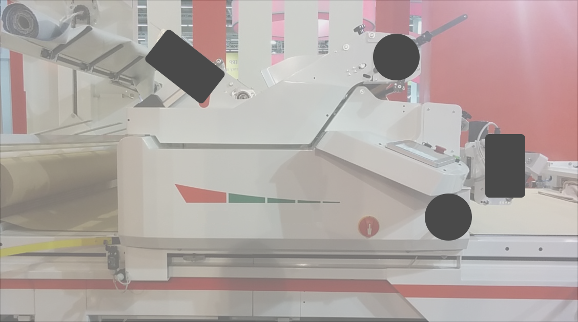
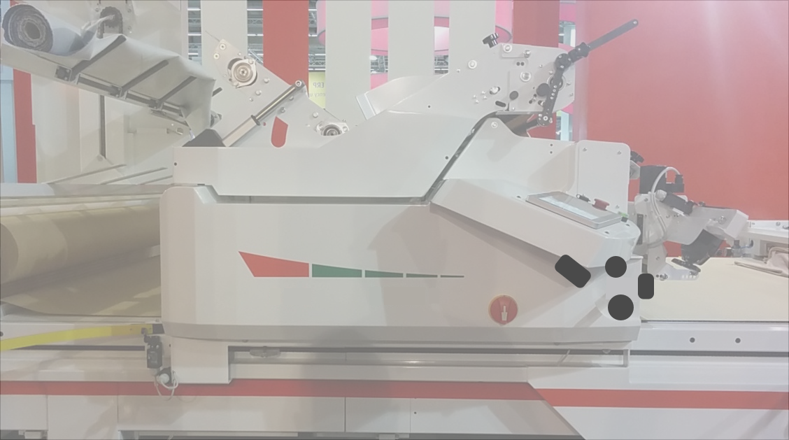
Morgan
2015
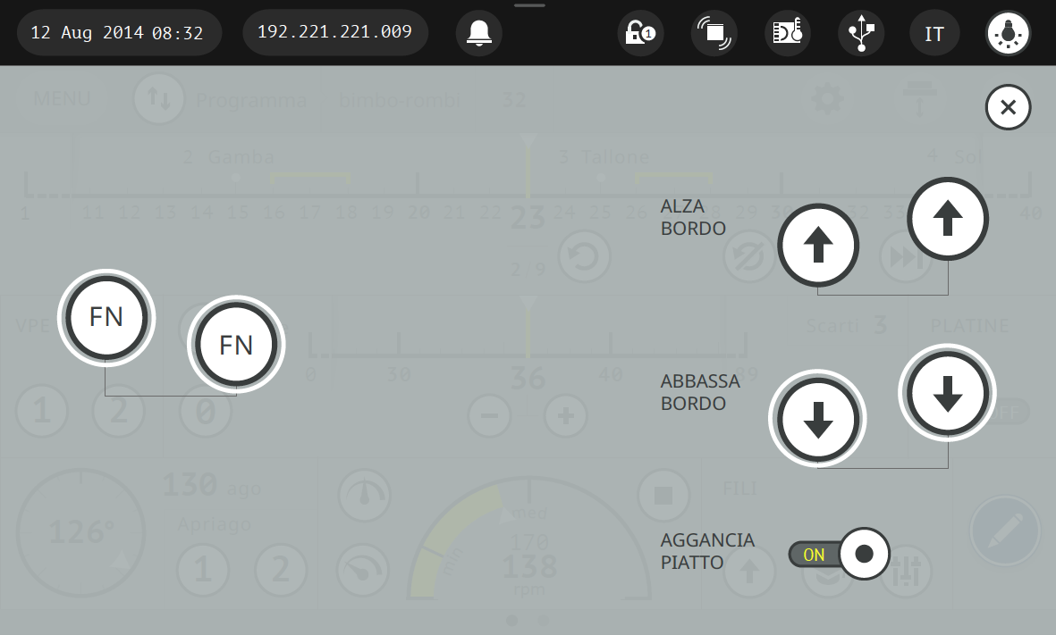
As the name suggests, this machine spreads all type of materials. The interface is based on a touch screen. But it's possible to manually control the machine with a handle and a switch.
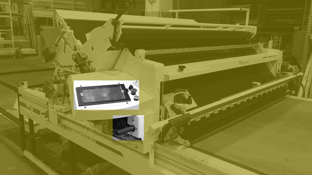
Creation of the "mattress"
Before spreading it's necessary to input data. Previously done with a virtual keyboard, now a more direct — finger friendly — manipulation input system
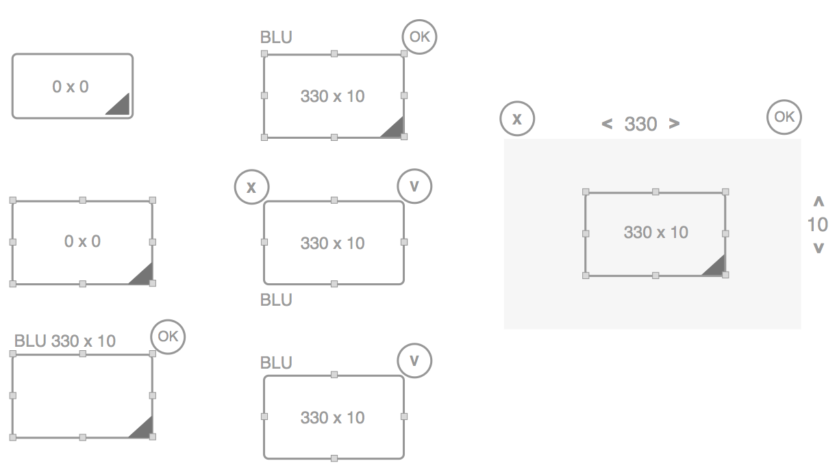
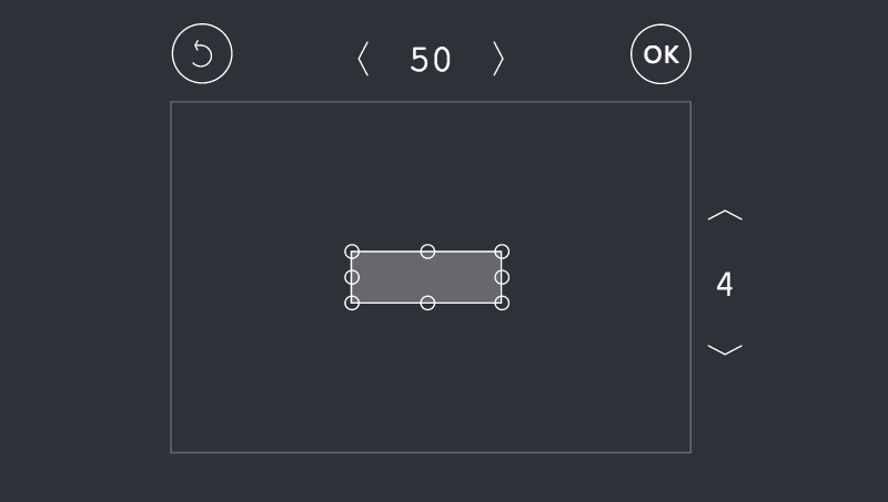
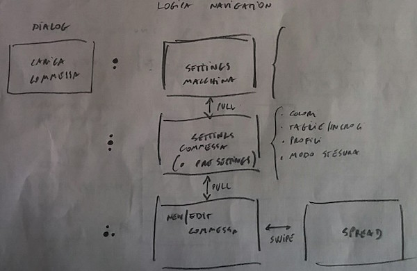
problem: modal manual controls. The switch change the result of moving the handle that controls 4 different engines. This introduces modes on the handle. And where there are modes there are users' errors.
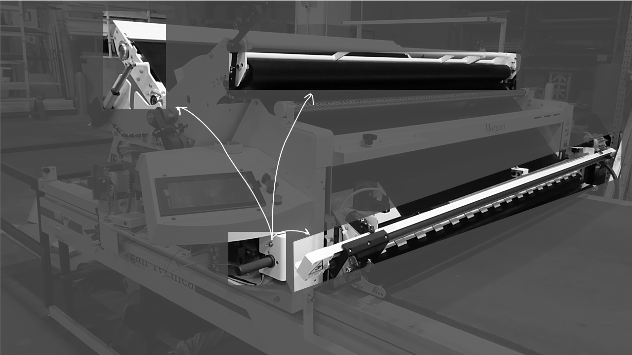
Solution: no mode controls mapping the four engines of the machine.
This should help the operator to learn. The use of the switch control was based on memory, while this "console" is based on mapping and recognition.
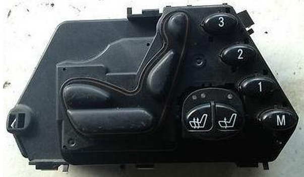
The design logic is that of Mercedes' seat control.

Putting elements in different positions on the 'create order' view
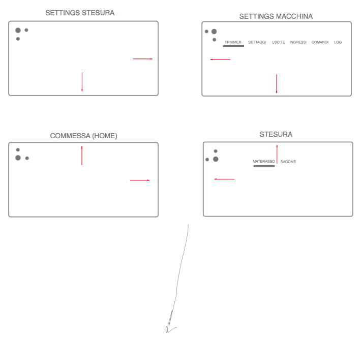
navigation: gesture based "map" copied inspired by Jolla phone
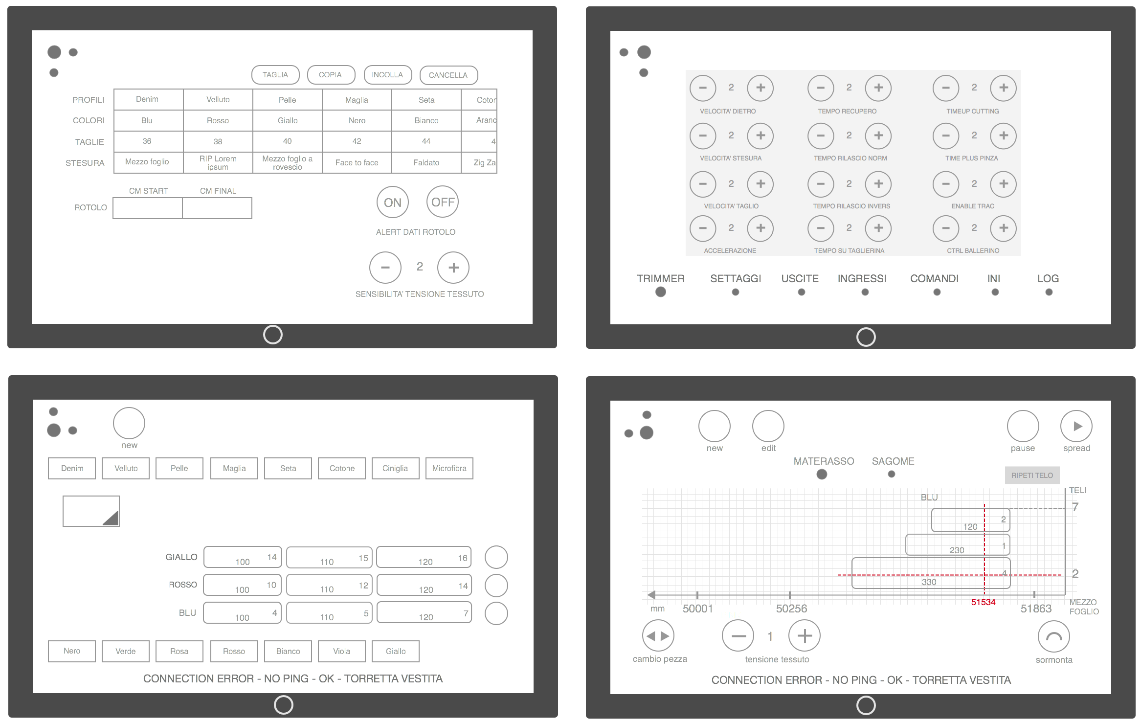
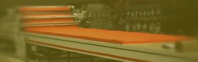
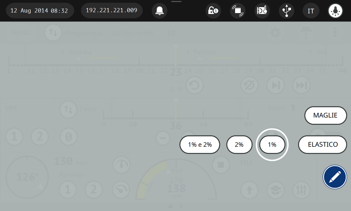
The labeller prints on the spread material as many labels as are the pieces that will be cut by the cutter machine.
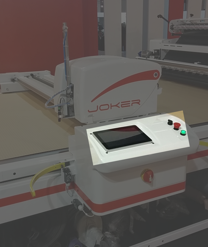
The design concept is similar to that of the spreader. The two machines work close to each other, and are often used by the same person, it's easier if the interfaces have the same design logic.

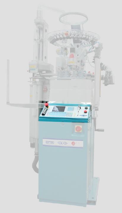
Lonati
2014
user interface designer
A leading world manufacturer in the production of sock-knitting machines. 2 design concepts for the new machine (we were not asked to deliver a complete wireframe). Design for productivity was mandatory. Ideally each operation with the new interface should take less time. The new design allows for quick operations. Less steps. Flow based on real operations. Clear labels. Meaninful icons.
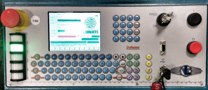
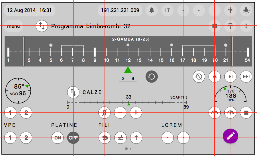
Rams inspired the careful alignment of buttons. This should help the user remember their position without looking at them.
One constraint was that for a couple of dangerous operations the user should use two hands. The standard solution in the industry is to use far away physical buttons. The new solution is consistent with the final only touch screen interface concept.
Swipe gestures are not always friendly because they are invisible. There's a way to use gestures or taps that makes using the interface easy. I introduced this concept in the interface design for 2 recurring editing operations.
Egro
2014
user interface designer
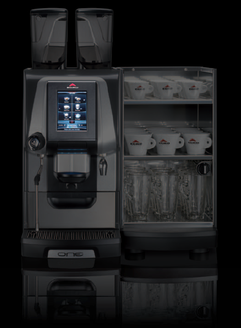
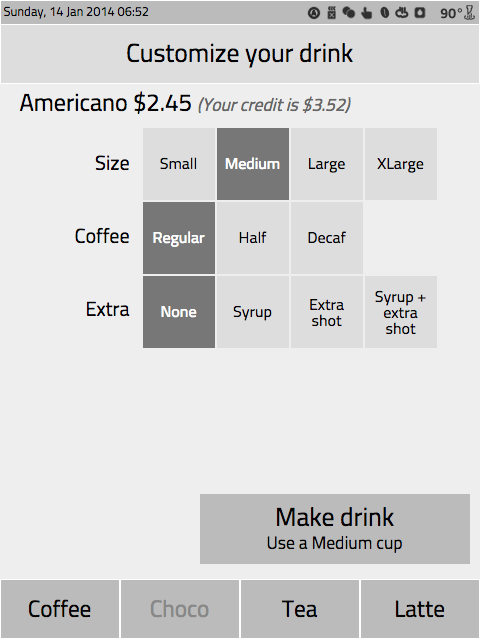
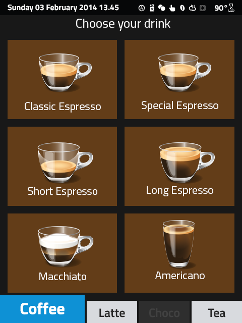
Egro is a brand of the Italy-based espresso machine manufacturer Rancilio. They hired me to design a touch interface for the new coffee machine Egro Multi Step. First machines are now (Jun 2015) at Chicago Hyatt McCormick place (Starbucks operated by Hyatt)
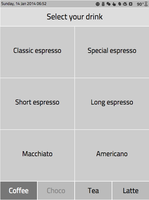
At the beginning every flow variant I created had the back button. It seemed natural to have a sort of temporal sequence in a "make coffee" process. The back button always pose problems, whatever the app.

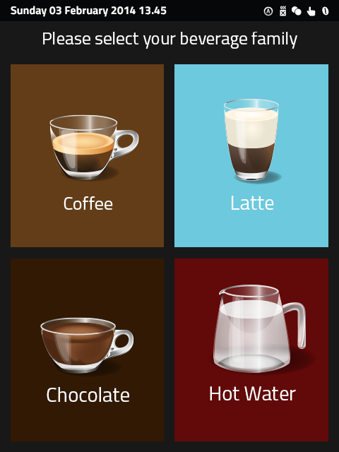
A superior flow, with no back button, short and clear.

Aside
To Read
2014
product designer, developer & visual
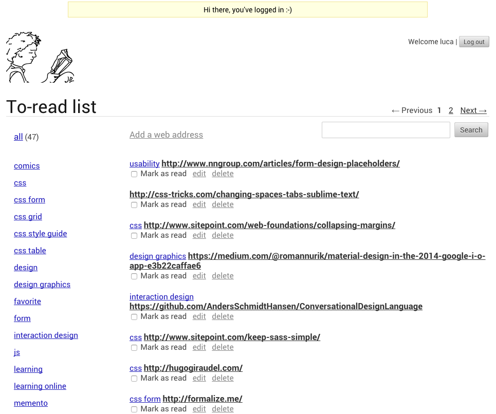
The app aim is to help people to save web addresses about stuff they want to read later. Then, to retrieve and actually read this stuff later.

Saving something to read later is different from saving something we love. Bookmarking apps usually are designed to satisfy the latter need.
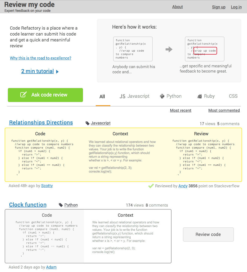
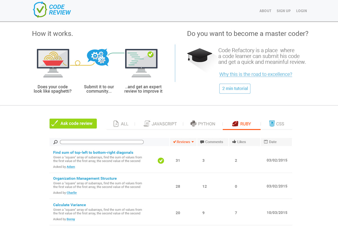
Code review
2015
product designer, front-end developer
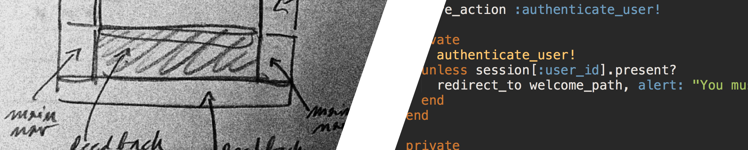
As a student of JS and Ruby I have often found myself producing some ugly code that did the job. Wouldn't it be great to get some senior programmer feedback to improve that code? That's what this app is about.
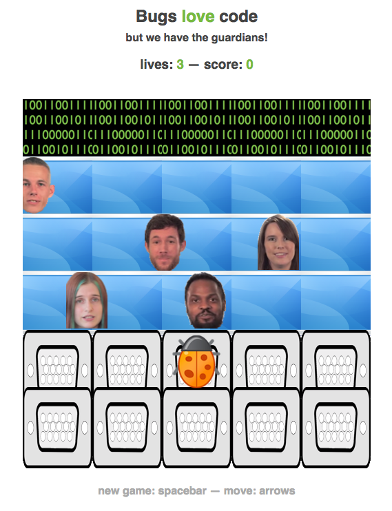
ARCADE GAME
2015
Developer
I built this game as the third project of the Udacity Frontend Nanodegree. It's a JavaScript game.
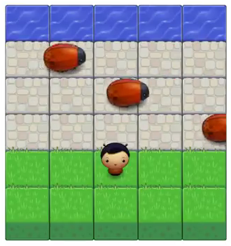
The project was about improving our js skills. We were given the objects: "enemies", "bugs", "grass", etc. There were no visual requests. But I couldn't help changing the visual a little. My users would be the Udacity teachers, so I changed the original metaphore: the teachers are the guardians of computer programs attacked by bugs. I plan to improve the game, I have many ideas.
"A beautiful product that doesn't work very well is ugly." — Jony Ive
© 2015